As the air turns crisp and light begins to fade earlier in the evening, color takes on a new responsibility in the home. Where summer’s palette may have leaned into airy pastels and breezy neutrals, autumn and early winter call for depth and grounding in the home. At The Shops at Carolina Furniture of Williamsburg, richly pigmented, emotionally resonant hues are taking center stage. Tones that feel thoughtfully collected, cultivated with purpose, and quietly bold in their presence.
A Softer Take on Saturation
Image Courtesy: Gabby
This season’s palette is steeped in warmth and depth. Moody greens like moss, olive, and sage feel organic and lived in. Clays have evolved into weathered shades of terracotta and rose, more reminiscent of natural stone than pigment. Aubergine has become a year-round staple, offering richness without rigidity, while tobacco, a deep, understated brown, has found its way into everything from leather chairs to piping and trim.
What makes these hues sing is how they’re being used. Gone is the impulse to drench a space in color; instead, there’s a move toward purposeful placement. A single moss green velvet chair can lend unexpected gravity to a pale linen space. Saffron-toned pillows or Roman shades spark quiet interest. Even a set of aubergine dining chairs reads like a new neutral when paired with natural woods.
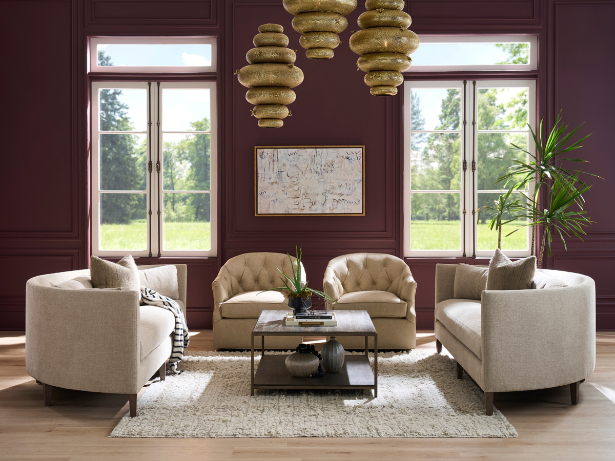
Woods That Deepen the Mood
Image Courtesy: Currey & Company
This cooler season has also ushered in a renewed love for deeply stained woods. Particularly wine-soaked finishes that hint at mahogany, espresso, or dark cherry. These tones offer the visual warmth of a crackling fire, lending structure and elegance to even the most casual of rooms.
Consider a casegood in a deep wood finish from Baker Furniture or Hickory Chair as your anchor. Whether it’s a sideboard, étagère, or dining table, the richness of the wood tells its own story. When paired with more muted fabrics and organic materials like woven rugs or brass accents, these pieces feel curated and timeless rather than overly formal.
How to Use These Colors with Intention
Image Courtesy: Cowtan & Tout
The key to working with these richer tones is moderation and balance. Rather than painting an entire room in moody green, use it as a backdrop or through upholstery and accessories. Try layering warm tones gradually, like a clay-toned wall behind a tobacco leather sofa, or aubergine drapery paired with an antique brass lamp.
Color also benefits from contrast. Moody hues feel more grounded when set against something airy: an ivory plaster mirror, a washed oak coffee table, or a soft flax-toned rug. These moments of visual breath keep the space from tipping into heaviness.
A Collected Palette
Image Courtesy: Stout Textiles
Ultimately, this color story is about layering. Not just colors, but time, texture, and mood. The goal isn’t to match, but to resonate. Use these tones as accents, foundations, or small surprise moments, like a wine-colored glass vase or a moss velvet bench tucked into the hallway.
At The Shops at Carolina Furniture, our showroom is curated to help you see these palettes come to life. Whether you’re ready for a seasonal refresh or looking to invest in timeless pieces, we’re here to help you find color that speaks not just to the season, but to the soul.
Let the palette evolve with the days. And let every tone, moody, muted, or bold, feel like it belongs exactly where it is.